So, step by step, this is what I did:
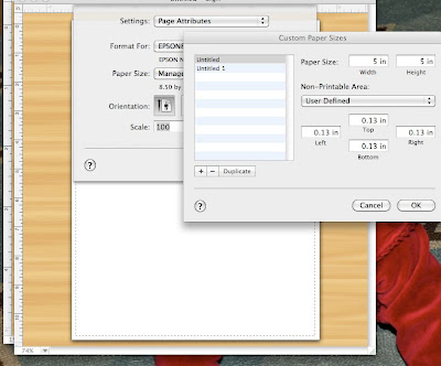
1. I do not have Photoshop, and I do have Print Shop 2 for my Mac. Again, this could be very archaic, but it's what worked for me! Open a new blank document, and select File-Page Setup-Paper Size-Manage Custom Sizes, and set your paper size to 5 in. by 5 in. (Most buttons are a square or circle, and this just helped me with parameters for while I was designing...no great reason for this size!)
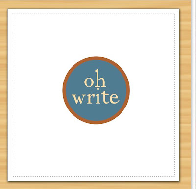
2. Design away! I chose to start with something simple that was true to the color and look of my blog. Someday I might get a fancy logo or more elaborate design, but for now this is what I came up with! Save your project as you go.
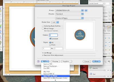
3. There are probably a million better ways to do this next step, but this is what I found to work for me! Select File-Print-PDF(this is a drop-down menu)-Save PDF to iPhoto. This miraculously turns your project into a .jpeg format that you can upload to Flickr.
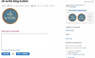
4. Upload your photo to Flickr.
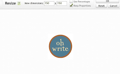
5. Once your .jpeg has been uploaded, select Edit-Resize, and set the dimensions to 150x150. This will make it so your image is the right size for a button. Next click OK, then Save.
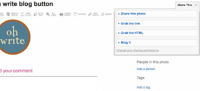
6. Double check to be sure 'anyone' can see this photo. Now click on Share This-Grab the HTML. This is the special code you will need to link back to the picture, which is stored on Flickr. Be sure to copy the entire thing. At this point, I just kept clicking back and forth between windows, but you might want to just copy and paste it into a word document so you have easy access to it for the rest of the process.
7. For the remainder of the process, I accessed two other blogs that I found to be extremely helpful. You can find them here:
www.musingsofahousewife.com (How to design a blog button)
www.jenieshell.blogspot.com (How to make a blog button)
www.jenieshell.blogspot.com (How to make a scroll box)
www.jenieshell.blogspot.com (How to display unreadable html code)
Between these 4 pages, I was able to make my button work! I did change a couple of things from the scroll box tutorial. Here is the code as I found it to work for me. (I centered it, changed the outline and the size from the original tutorial):
<center><div style="border: 1px solid black; overflow: auto; height:
50px; width: 100px; color: black; background-color: white;">YOUR TEXT HERE</div></center>
Happy button-making! I'd love to see what you come up with if this works for you!
For some more great DIY inspiration, stop by:


Good for you! This is on my "to do" list for this summer. I appreciate the "dummy" version! I like the simplicity of your button, it looks great!
ReplyDeleteI have so been wanting to figure out how to do this, so thank you! I hope I can figure it out! Yours is pretty cute!
ReplyDeleteOkay it's taken like a million years, but I figured out the horizontal social networking buttons. It's pretty much the same as your button tutorial above, yet you resize the button to about 35X35 or 40X40 and install them all into the same "add html" gadget in blogger! Yay!
ReplyDelete